Marketing
Company
COTY is a business with offices worldwide. From their inception in 1904 they became a Global Leader in Beauty and have built a unique portfolio of beauty brands that have produced some of the strongest consumer franchises in history.
Brief
The existing business was accommodated in small commercial offices in Box Hill + they were looking to relocate to a new commercial office space in an area that would align with their brand and project their desired image within their industry.
The suburb of Richmond was chosen for the relocation and fitout + the space secured was in a new + fashionable yet unique and design oriented space.
The brief provided to IN2 SPACE detailed the company's desire to be accommodated in a fashion that would highlight its long standing reputation as a provider of highly successful beauty products to the consumer industry.
Inefficiencies in the existing layout of their commercial office space in Melbourne + a lack of appropriate facilities were crucial areas to be addressed in order to achieve the desired outcome.
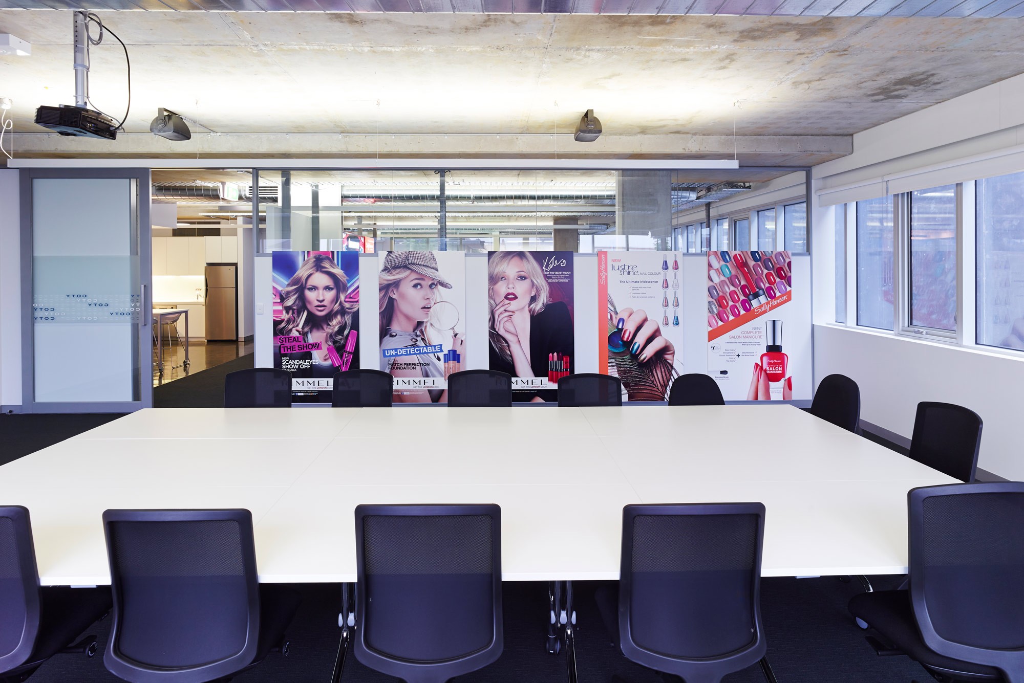
Business partners would be attending the space for product training sessions so the premises needed to cater for various types of groups.
They needed a facility that would be versatile + that they could be proud to showcase.
Most of their clients were female + historically will be female so that needed to be kept in mind for the final outcome.
Size
300sqm of commercial office fit out space in Melbourne
Outcome
IN2 SPACE provided a complete Design + Documentation service for the company’s move into to their Melbourne fitted out space.
The building chosen for the new offices was new, fashionable yet unique + a design oriented space.
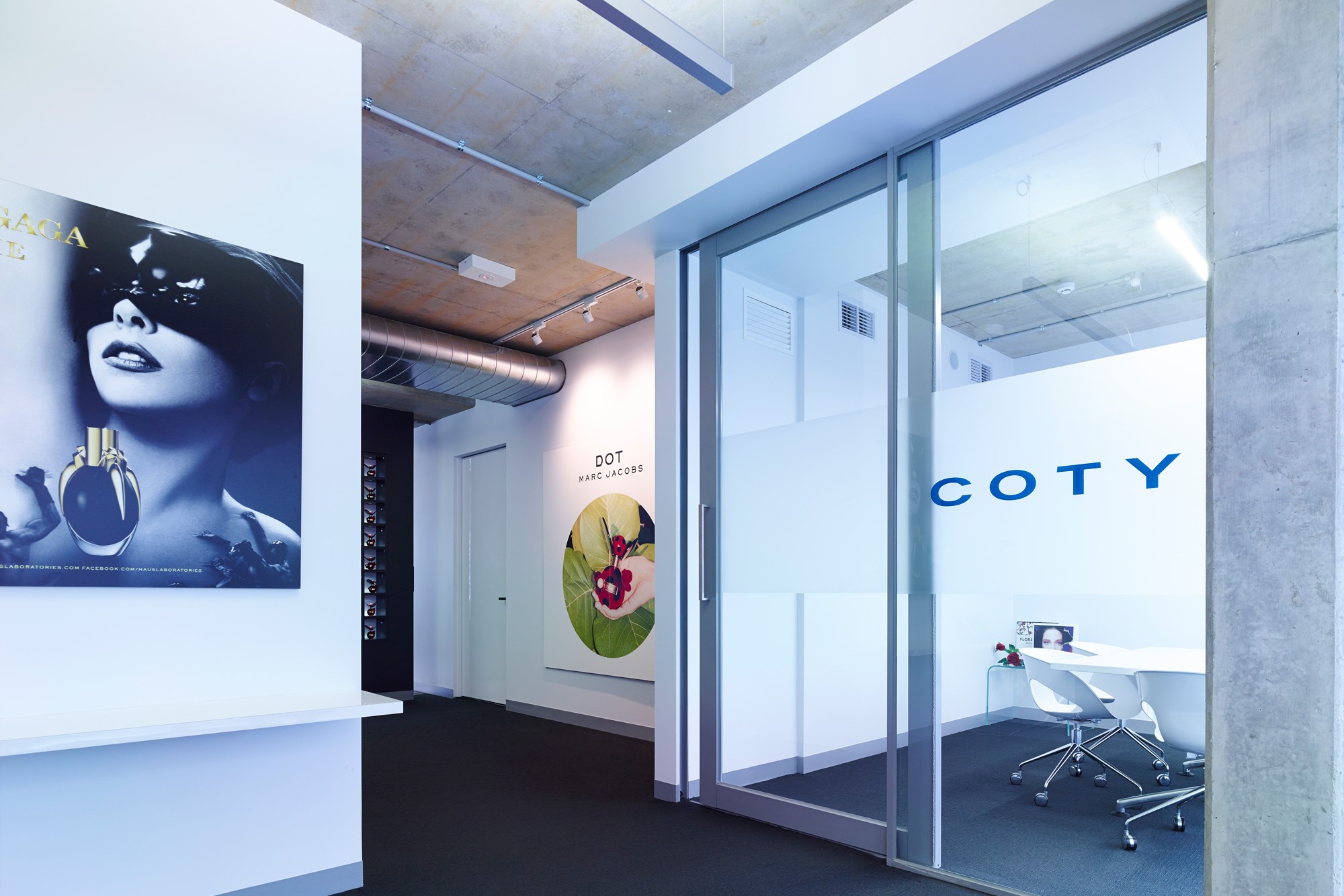
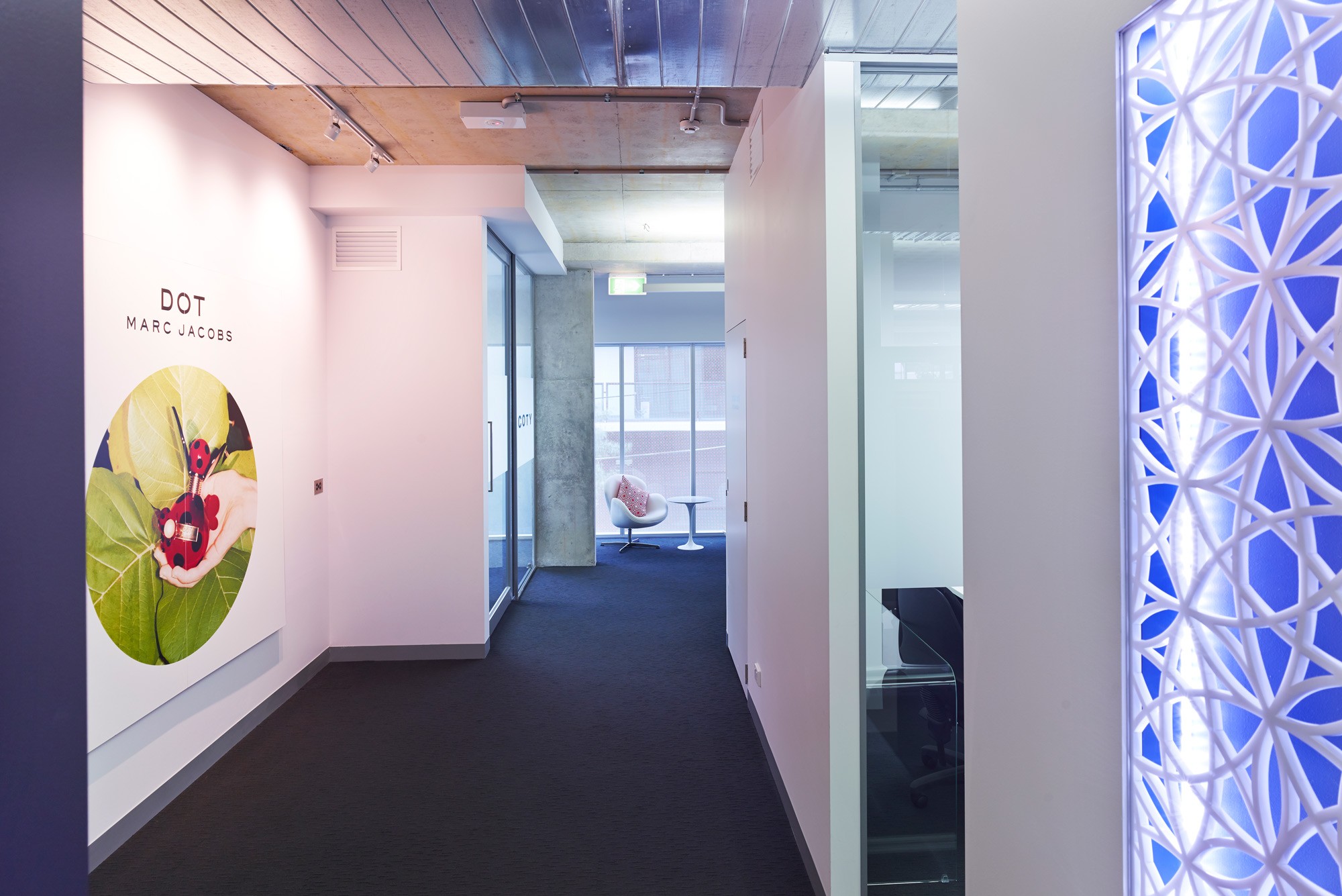
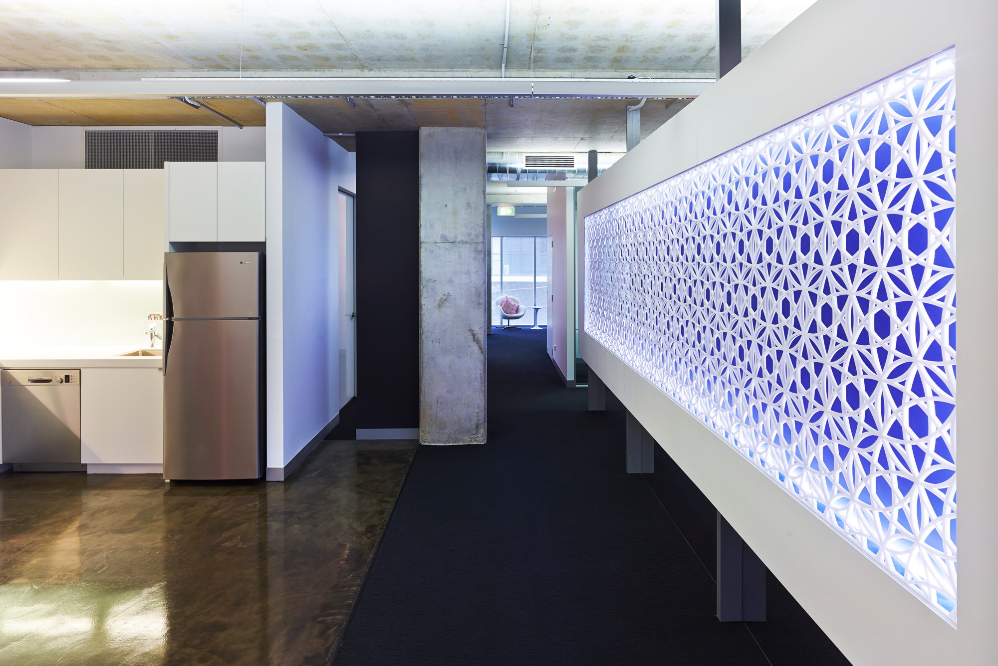
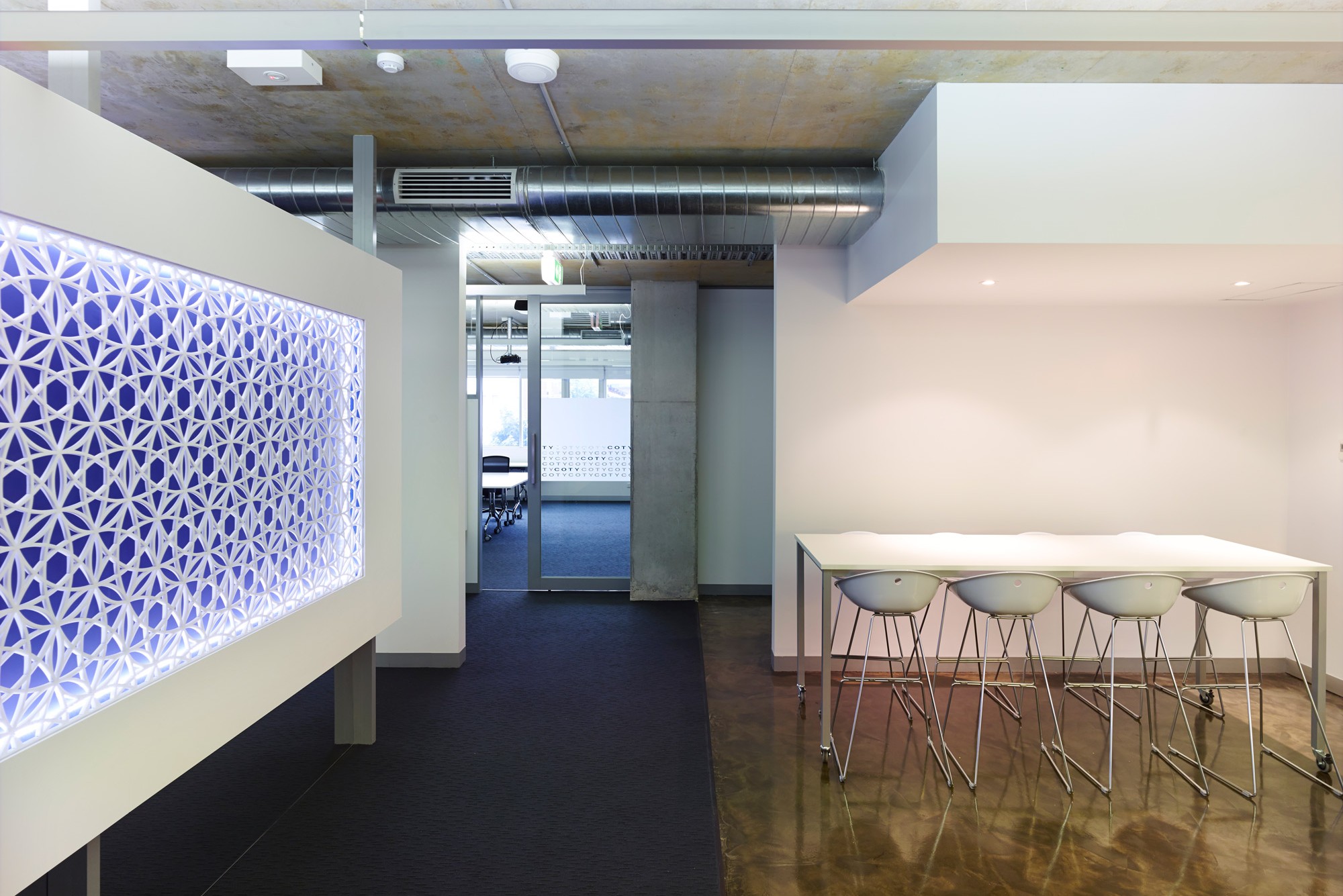
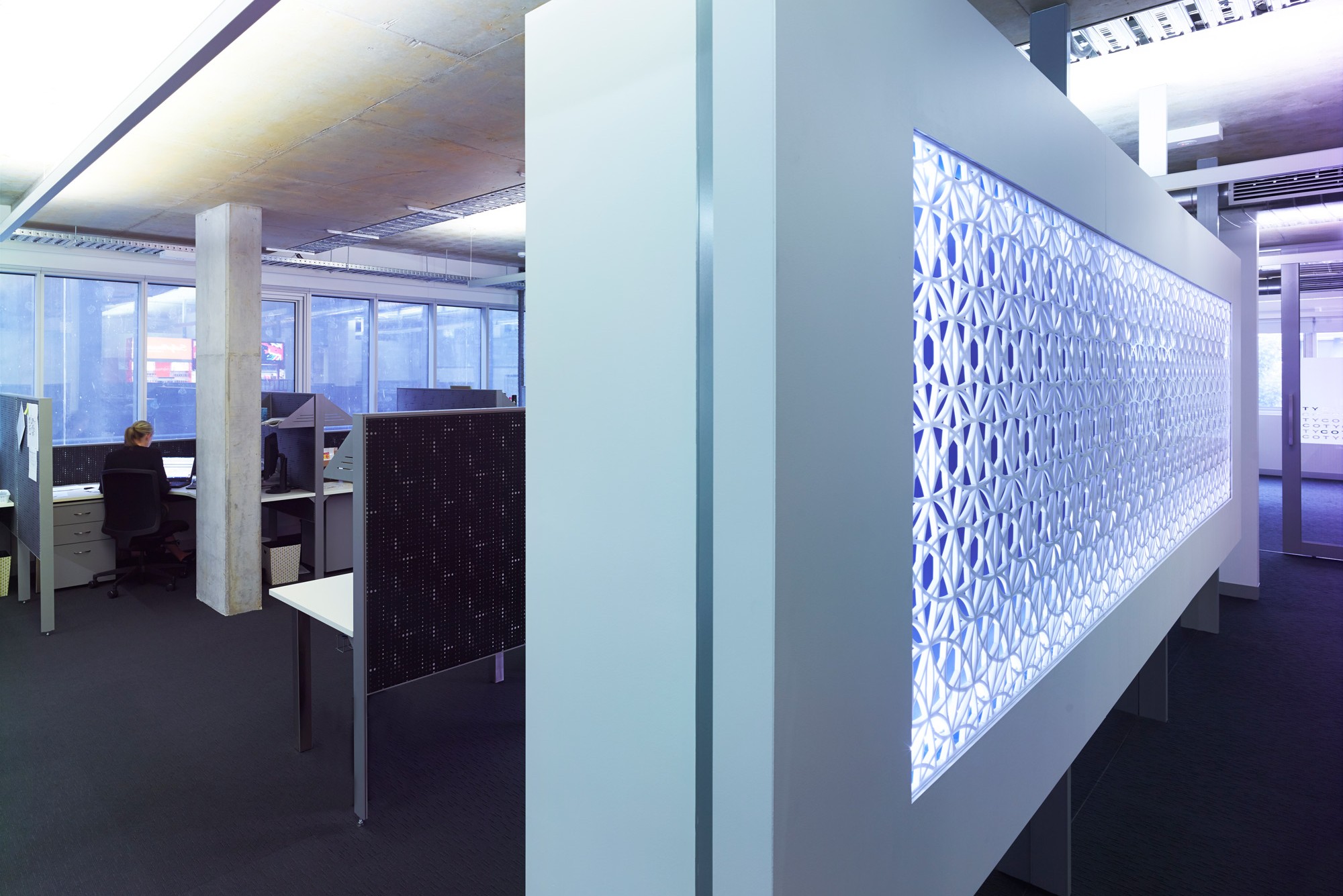
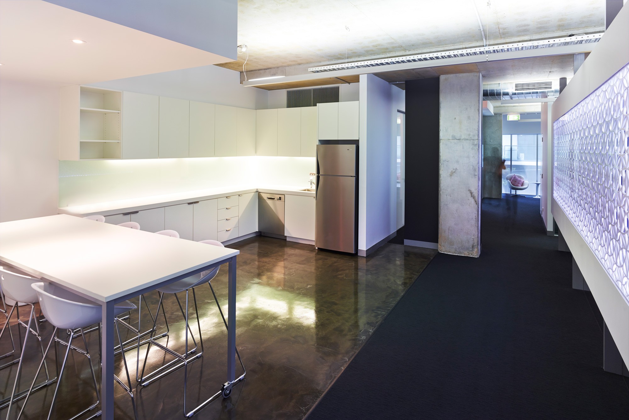
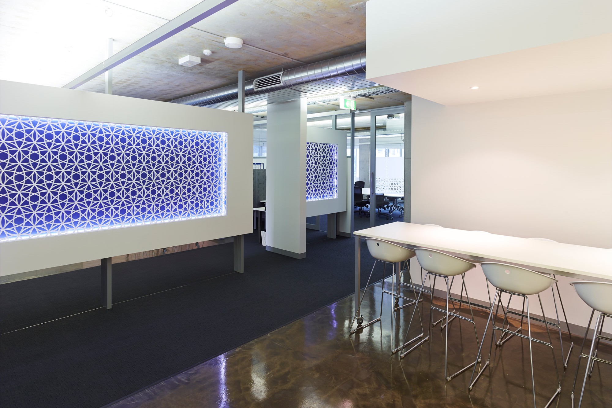
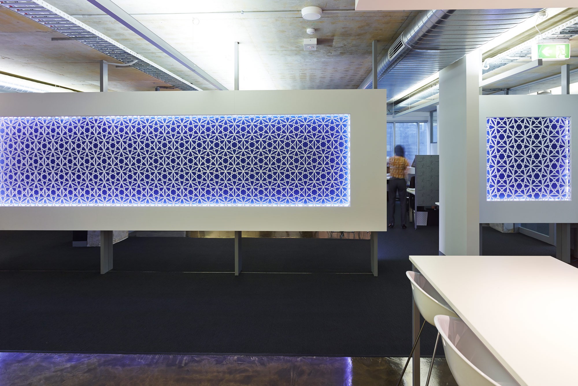
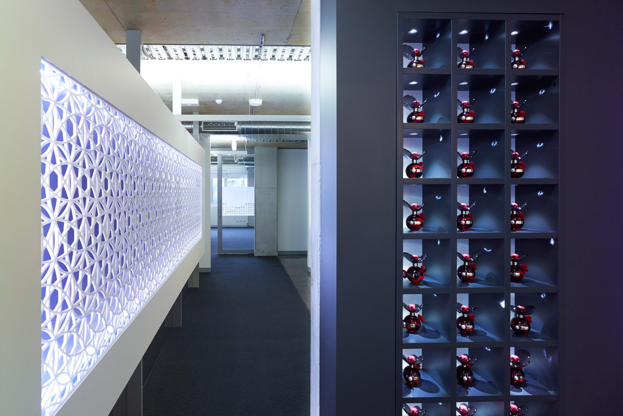
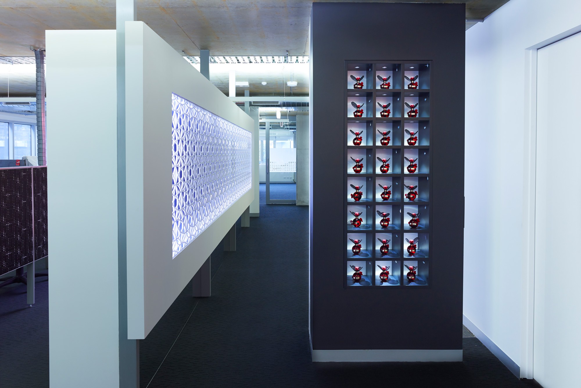
IN2 SPACE enjoyed exploiting + accentuating the building's best characteristics; unveiling a raw concrete ceiling, suspended feature light fittings + part of the natural concrete slab. The use of exposed building services complimented the overall clean, warehouse-style look that was achieved.
The overall impact achieved was a dynamic energetic one with imagery + mood lighting used to further add impact.
The space was functional + catered for the ever growing staff numbers with areas provided for showcasing their products, training + hosting business partners.
The colour palette used was understated and combined with the finishes, achieved a warm yet visually exciting interior.
Here are more examples of our office design for marketing companies.
