Finance / Insurance
Company
Koda Capital + Flinders Investment Partners/Westoz; Koda Capital provides private wealth management + Flinders Investment Partners/Westoz is a funds management organisation managing Listed Investment companies.
Brief
The two separate but sector-related businesses have setup operations in Melbourne + are looking at occupying office space independently but where they can share common facilities.
The brief was to independently cater for each business as its own entity; providing separate + independent client reception spaces and general office working facilities but sharing some common meeting rooms and facilities.
The décor of the public space was to be designed to target a more mature clientele portraying a warm, tasteful but understated tone.
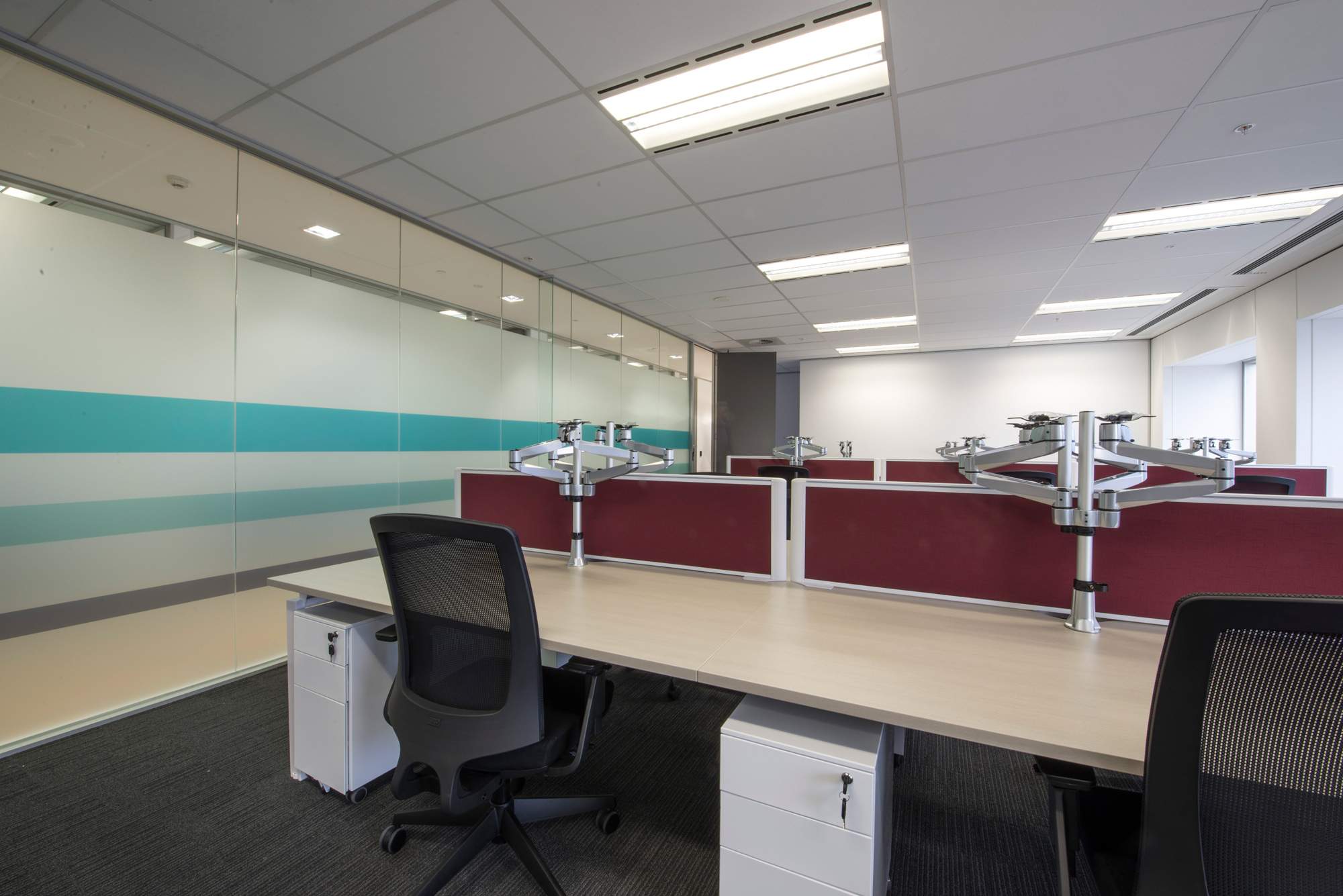
Efficiency + flexibility in the workspace was paramount to cater for the further planned growth in the business.
Size
500sqm of commercial office space
Outcome
IN2 SPACE were successful + excited to be chosen to undertake the Melbourne office design project. IN2 SPACE provided a complete Design + Documentation service for the new Melbourne offices.
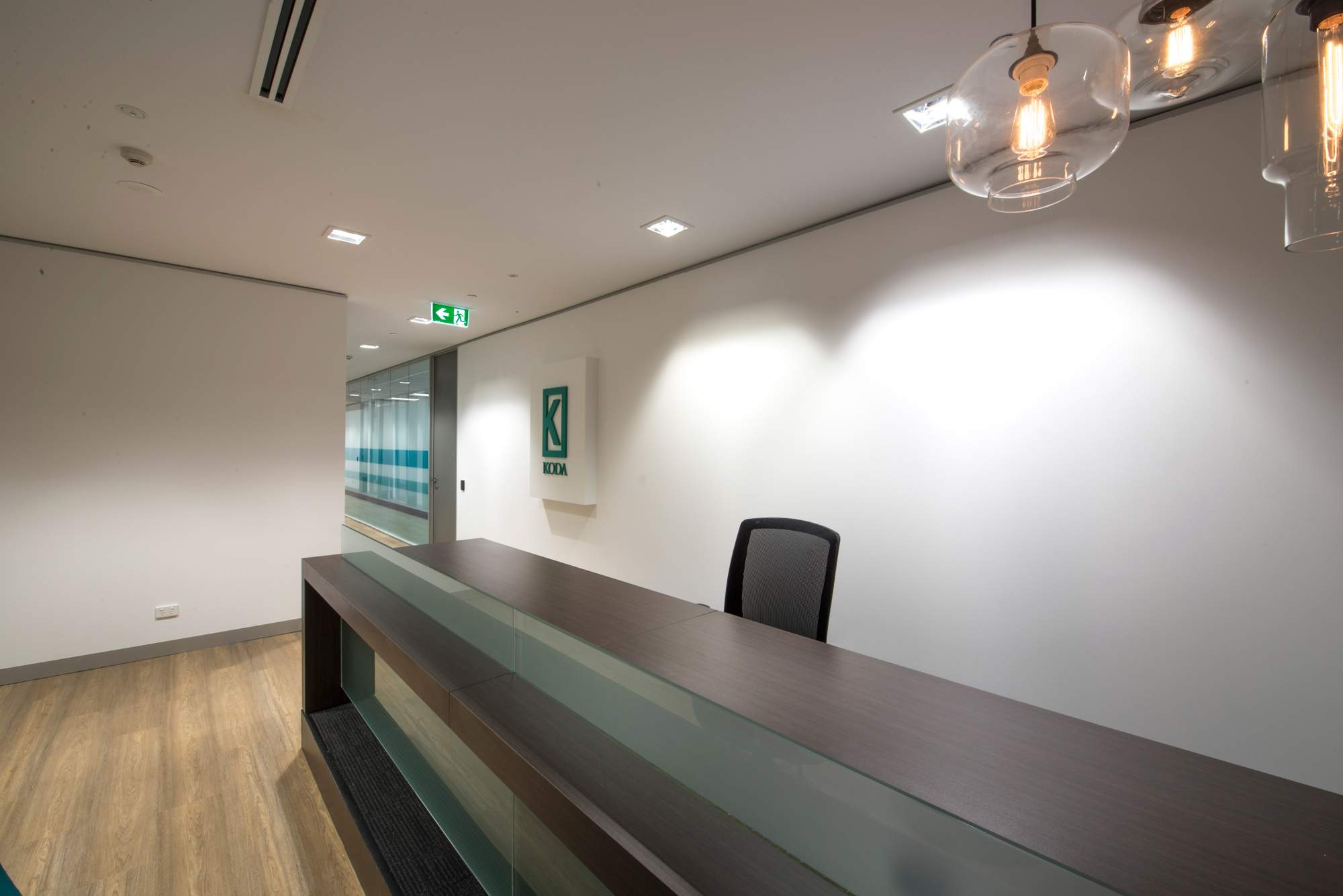
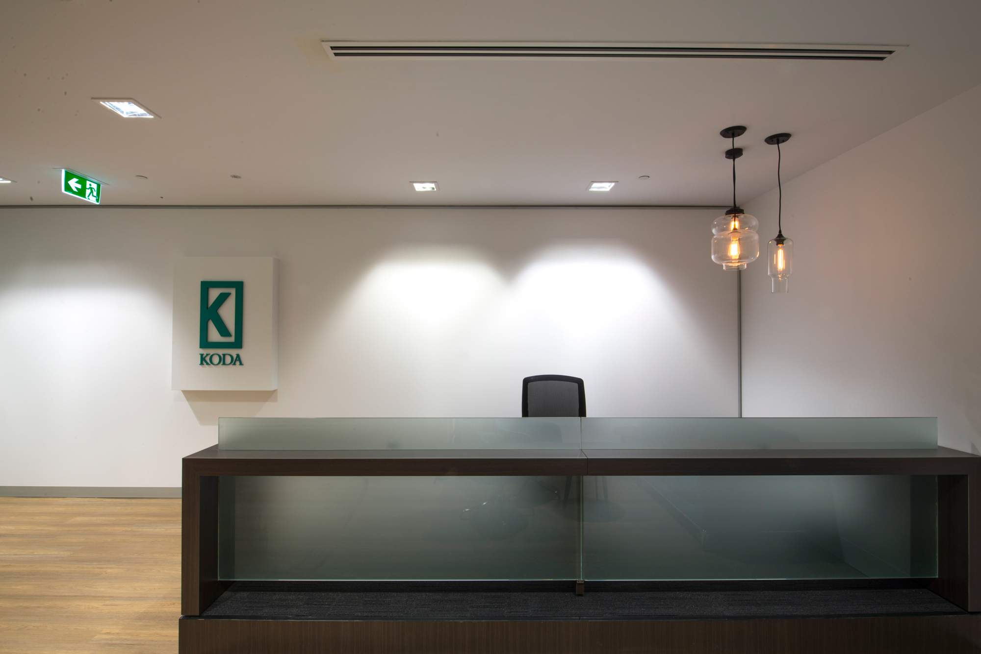
The office design solution allowed Koda Capital + Flinders Investment Partners/Westoz to securely + independently occupy an office floor space where they could share some meeting facilities without trafficking any of the respective office work spaces. The resultant appearance of the interior was professional, inviting yet modern and tasteful.
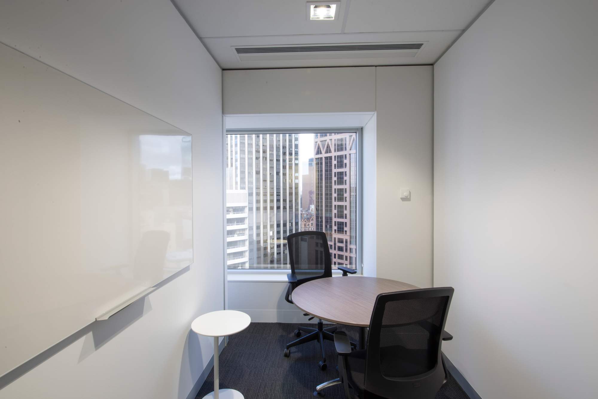
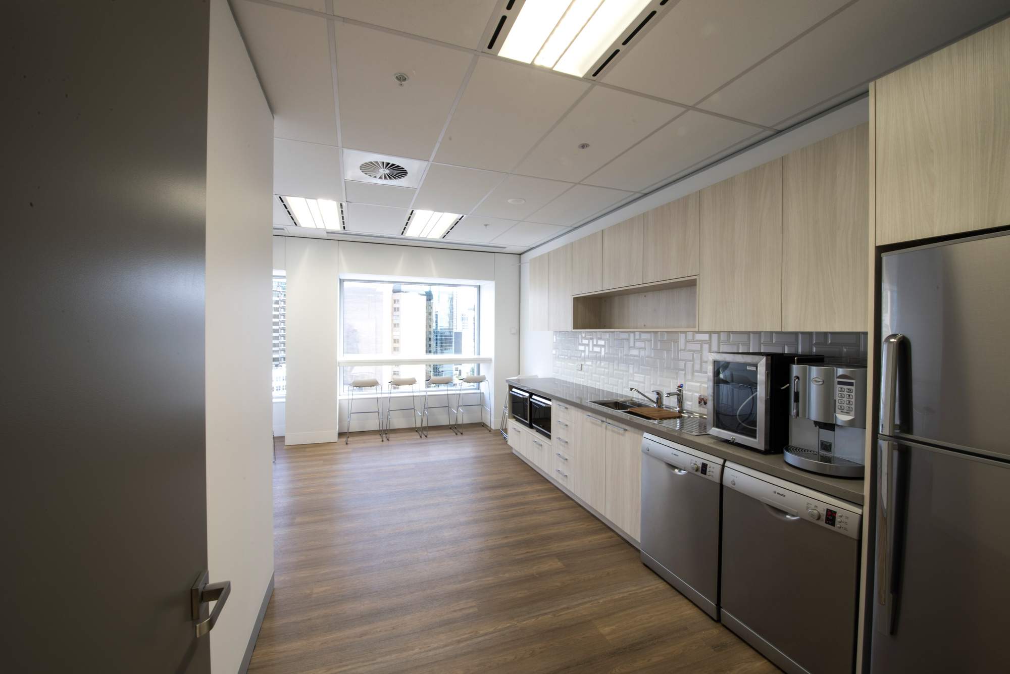
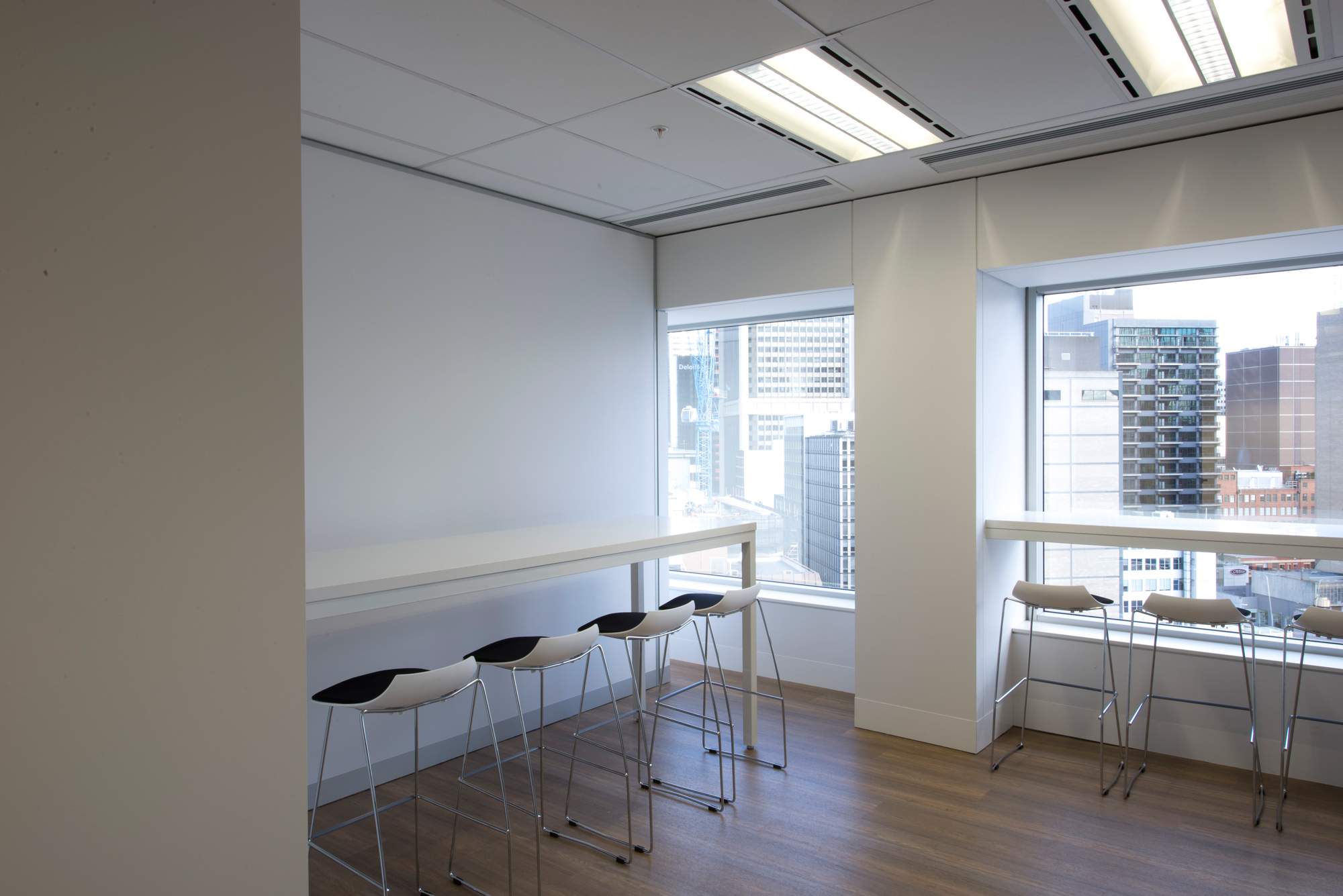
The meeting spaces + staff breakout area were located in a common area to each business which allowed the sharing of spaces without needing to access the work spaces.
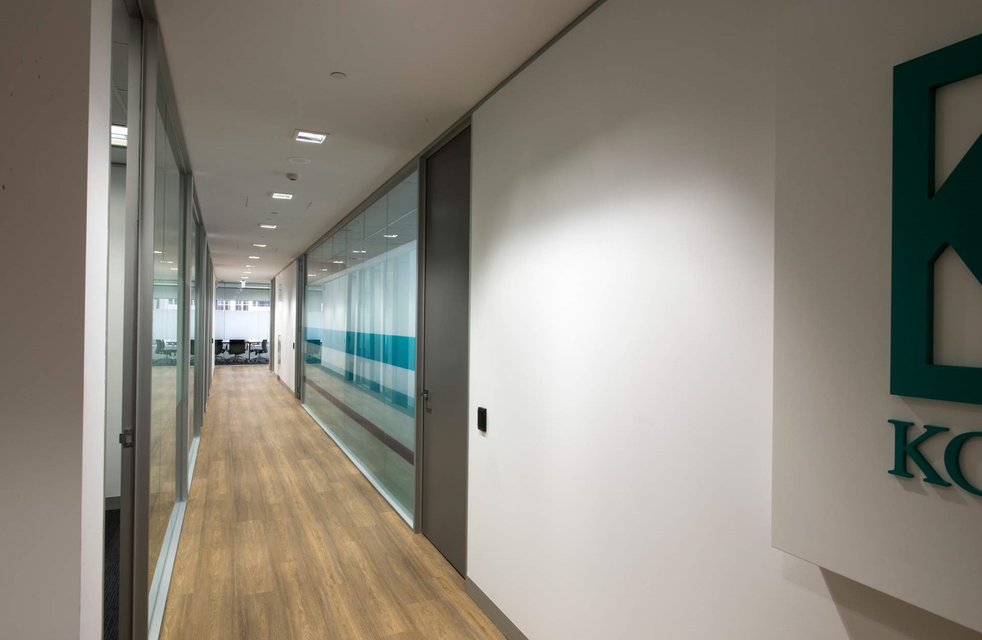
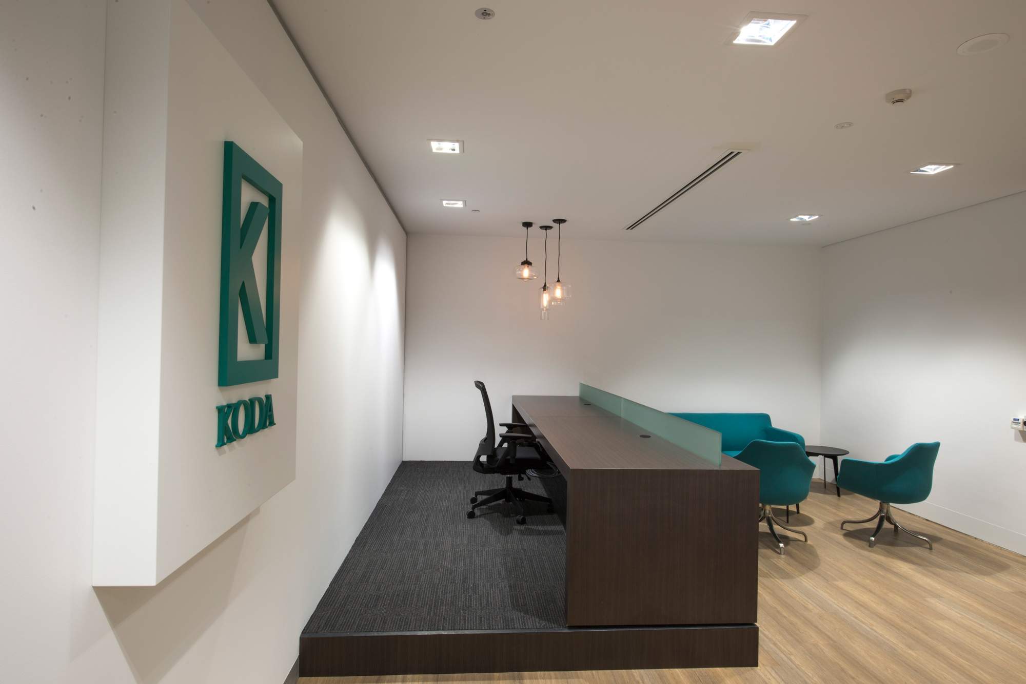
A vinyl plank timber look flooring product was laid on the floor throughout the common hall ways and the kitchen area. This product solved the issues of foot traffic noise, maintenance + serviceability without compromising the look of the space.
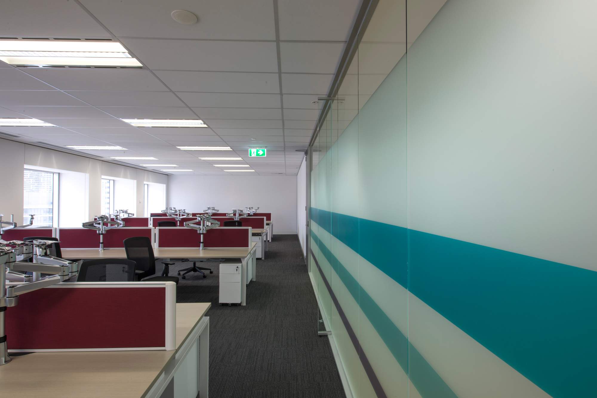
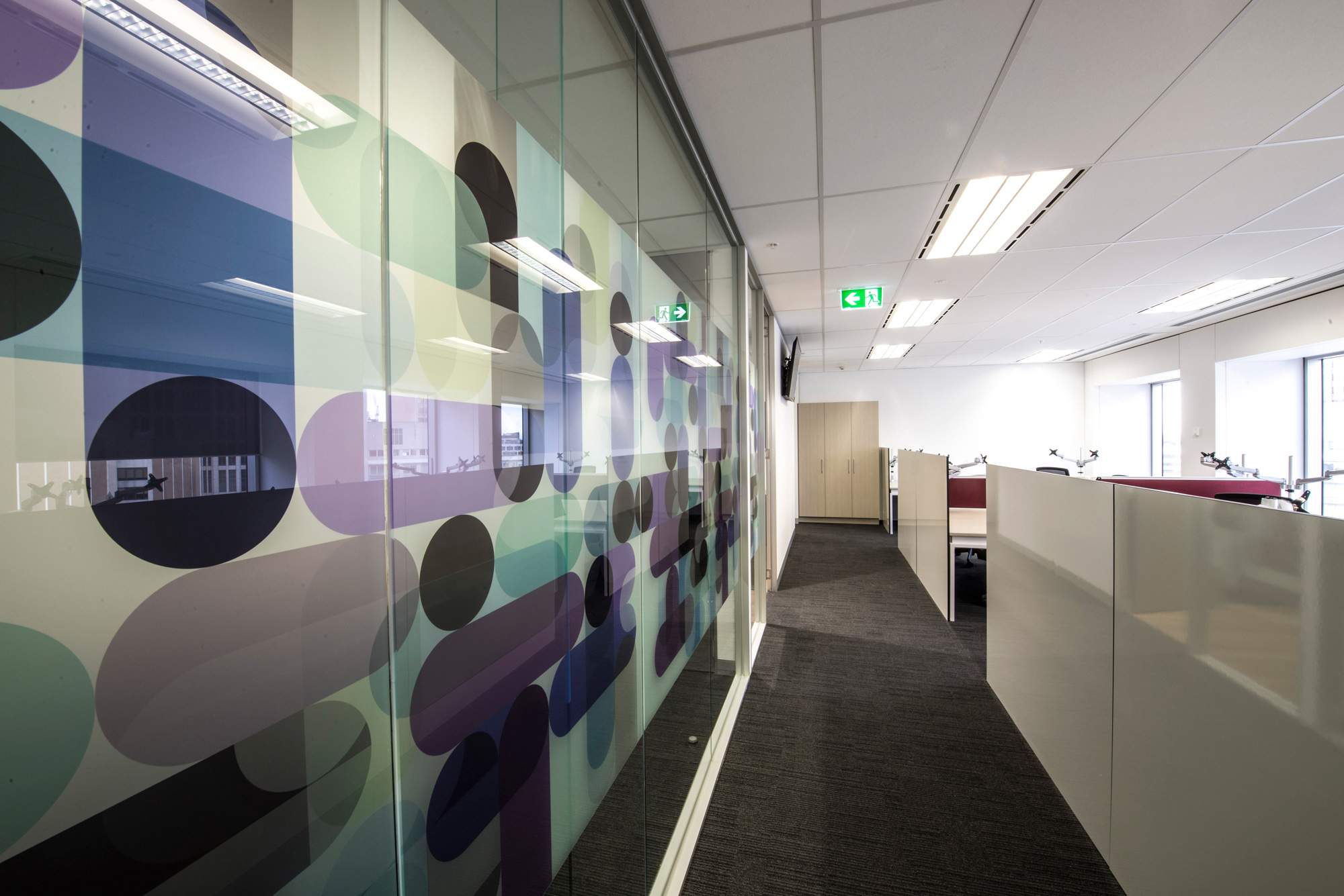
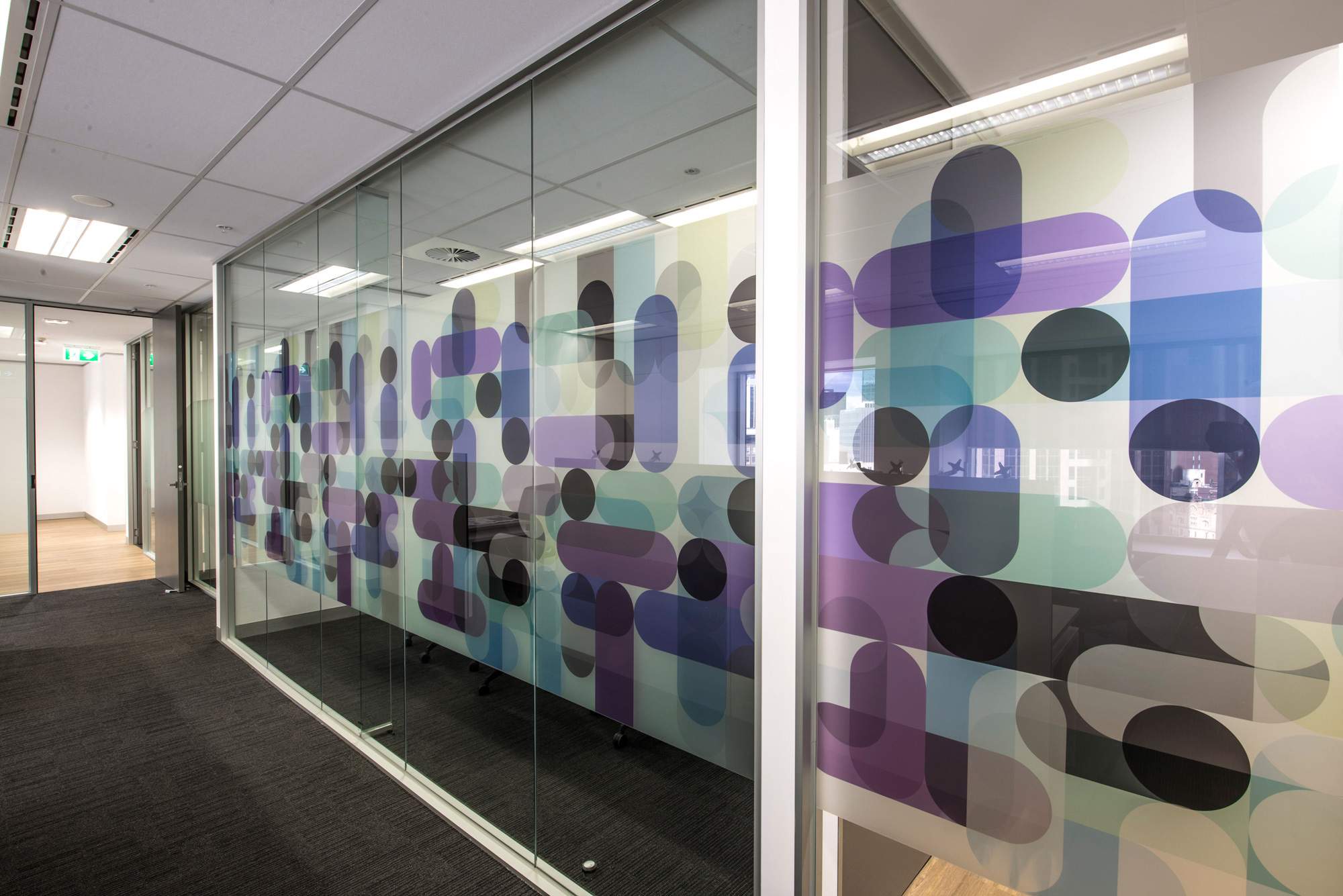
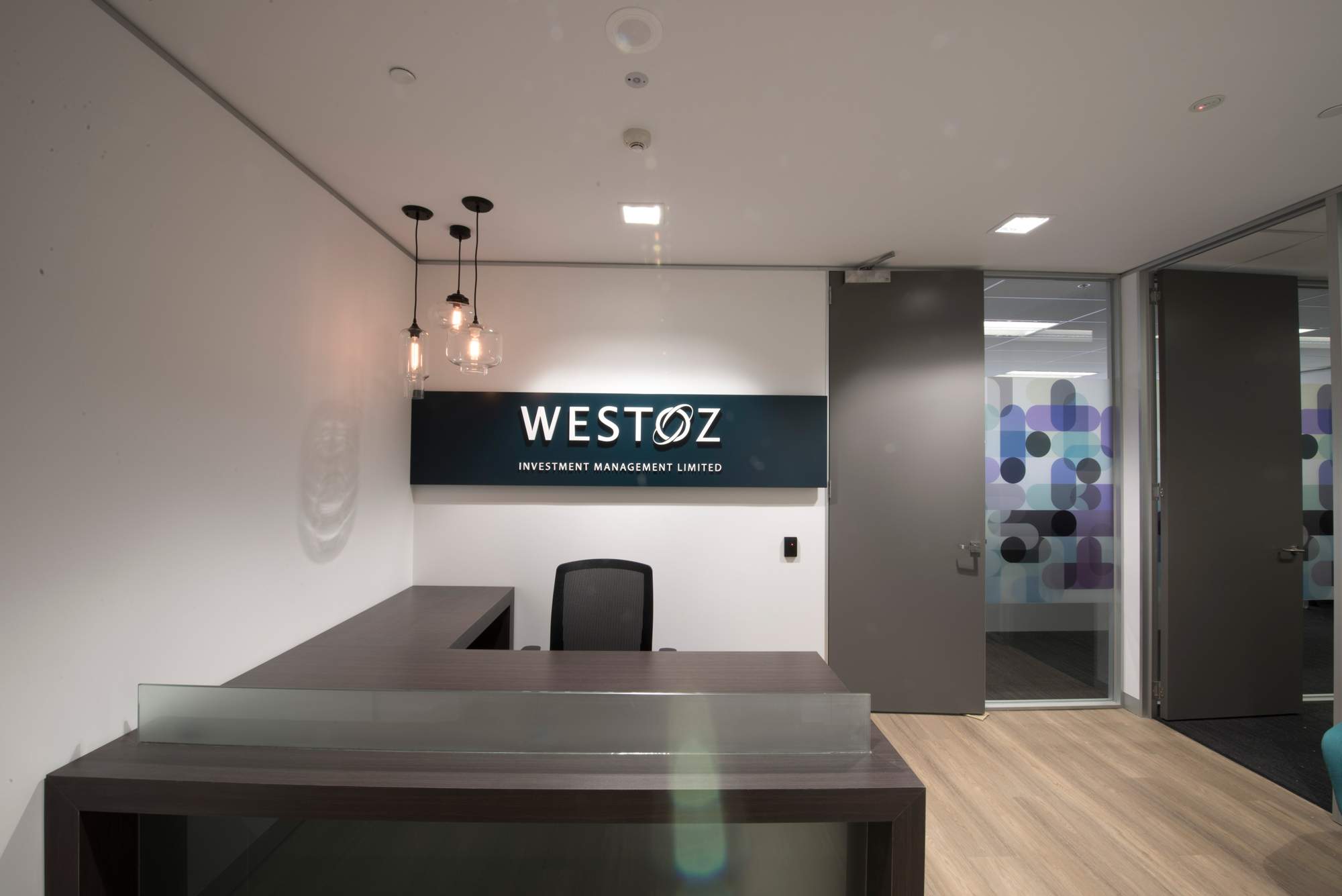
Various graphic images applied to vinyl film were used throughout the space to introduce movement + colour.
Feature clear glass pendant lighting was located above the reception desks to soften the space + introduce an element of interest.
The colour scheme chosen for the soft furnishings was a reflection of the business branding colours +complimentary colours were chosen to accentuate the over-colour palette.
This office fitout is a good example of how commercial interior design is not just about creating a space for one company but shows careful planning, creativity and experienced fitout designers who know how to make a space work when many considerations are factored in to the requirements.
Here is one of our Melbourne's office interior designers.

