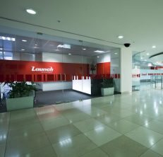
Designing an exceptional office requires a level of competence and experience that will take into account your company brand, colour and workspace.
These are just a few of the elements that make up an office design that gives your company the ‘wow’ factor. So let’s break that down so we can get a better idea of how that all comes into play with your ideal Melbourne office fitout.
Company Branding
A company’s brand is usually developed before you decide on the location of your office. Thus sometimes company branding and colour needs to be integrated based on the existing floorspace shape and internal structures whilst still maintaining integrity and marketability.
It’s important for any office interior designer to get a good grasp on your brand, company vision and identity. This needs to be accurately reflected for your products and services, clients and staff. Your reception or initial ‘meet and greet’ area can set the tone for visitor experience and interactions with you so it’s extremely important to get this right.
Surprisingly, how your office is designed based on your brand can impact the productivity of your staff. Further, how we communicate your brand is based on your culture and an expression of your vision and actions. For example, a nicely designed space that accounts for staff would provide natural light, office interiors and furniture that provide for health and comfort, amenities and facilities that reflect the culture; whether it be an active staff area or a quiet area. Attention to this shows a company’s commitment to their employees well-being and the payoff is worth it. Staff retention, happiness and effective productivity are huge cost savers.
An old and tired office design can be transformed with a refresh for the present and also design considerations for the future. This can include changes to your company logo to portray the look you want in line with your company mission, values and actions. IN2 SPACE Interior Design and Project Management, has been hired on many occasions to provide refurbishments for a variety of brands and office buildings and spaces. Ready to talk about your office design? Call us on 03 9348 1999
The idea here is to maximise the use of your brand yet at the same time, keep it consistent from entry point, through workspace, through to staff room. Great design shows your brand as permanent but moving forward through the years.
Understanding Colour and its Impact
We are surrounded by colour; colour in various shades, shapes and sizes. Then, when viewing online, colours can be variable. We make extremely fast decisions about how we choose to interact with people and products and a staggering 62 to 90% of this assessment is based on colour alone.
While there are other variables that do impact the perception of colour based on personal experiences and events, colour can still be a powerful influence and should be explored for its potential for your business.
Colour can be used to influence emotions. It can assist in many areas such as appetite reduction, calming people down and influencing perception of wait time. Further detailed research has been conducted to take into account more specific elements of colour when it comes to design.
Let’s take a look at some office designs:
Aside from our own office design portfolio, take a look at the designs below. Think about the ‘look and feel’. What atmosphere is it creating, how are the company colours used and how is the company brand displayed and portrayed? How does that space make you feel? How is it taking into consideration, clients, staff and anyone considering buying or working for the company?
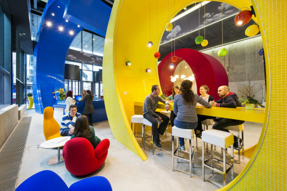
The following image is of a Google office. You can see the reception desk (in blue) behind the casual area. Bold, strong statement with large branding. Having a known brand name helps with perception. There aren’t many people that do not know ‘Google’. (Image credit)

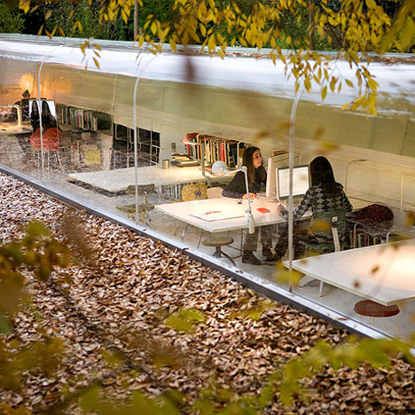
The following image is a very different design to the one above for a completely different company. This office is built in a garden setting for an architectural firm. The interior is light, creative and makes use of nature to compliment the design and add to the appeal for employees. (Image credit)

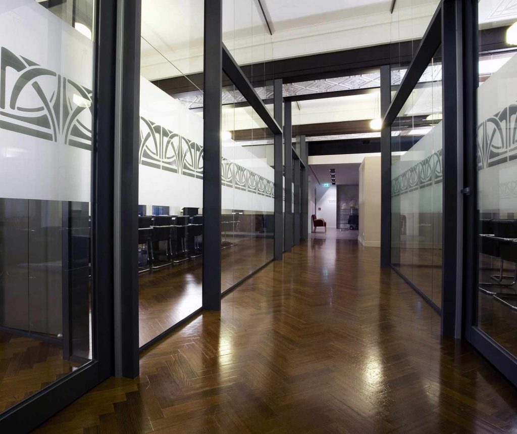
This following office we designed for Wisewoulds Lawyers. Tradition and trust flow through with colour, structure and design.

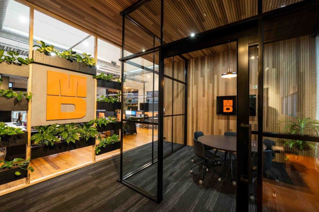
The following uses strong branding colours incorporated with shape, structure and lines to highlight the brand. See the office fitout for MD Projects.
Keep in mind that while it might seem like the ‘ideal’ design is cool and funky, a brand needs to convey the company values and image. Therefore what works in one case may not work for a completely different business. That’s where you, like all our clients, will lean on the experience of IN2 SPACE Interior Design and Project Management for an office workspace design that works for your business.
What are the Best Colours for Office Design?
Ideally, you have thoughtfully chosen brand colours that work for your company that are also based on research. So what are the best colours for an office fitout or interior design? Colours need to fit with your business model and market your brand effectively, not to its detriment. While one colour does not ‘fit all’, selecting the right brand colours can have an effective impact on the majority of those who attend your office.
If you have already decided on your office colours then we can assist you with the use of colour in the office floor plan layout and design to make a statement to clients and enhance employee morale.
Having a thorough comprehension of the elements that make an exceptional office design is where our reputation here at IN2 SPACE Interior Design and Project Management, precedes us. If you do not have any established brand colours yet then speak with our team or your marketing and branding people before making a decision.
