Building Upgrades
Company
398 Lonsdale Street is situated between Queen + Elizabeth streets Melbourne + occupies an area surrounded by private education + trades colleges with neighbouring retail stores.
The area is an extremely busy hub with public transport facilities directly in front of the building.
Brief
To update the appearance of the lobby space + create a modern, uncluttered entrance as the existing retail stores surrounding the lobby internally were visually impacting the area.
The building was initially built in the 1970's + had undergone a refurbishment in the 1980's but it lacked the professional commercial appearance which office buildings require.
The brief provided to IN2 SPACE was to create an inviting + contemporary entrance/ground floor lobby space which would enable the landlord + building to attract the calibre of tenant desired going forward.
Size
100sqm of commercial office lobby space in Melbourne
Outcome
IN2 SPACE were chosen from a list of design firms to provide a complete service, Designing + Documenting all works for the refurbishment project. The ground floor building lobby + entrance were given a revamp with a face-lift to the main area .
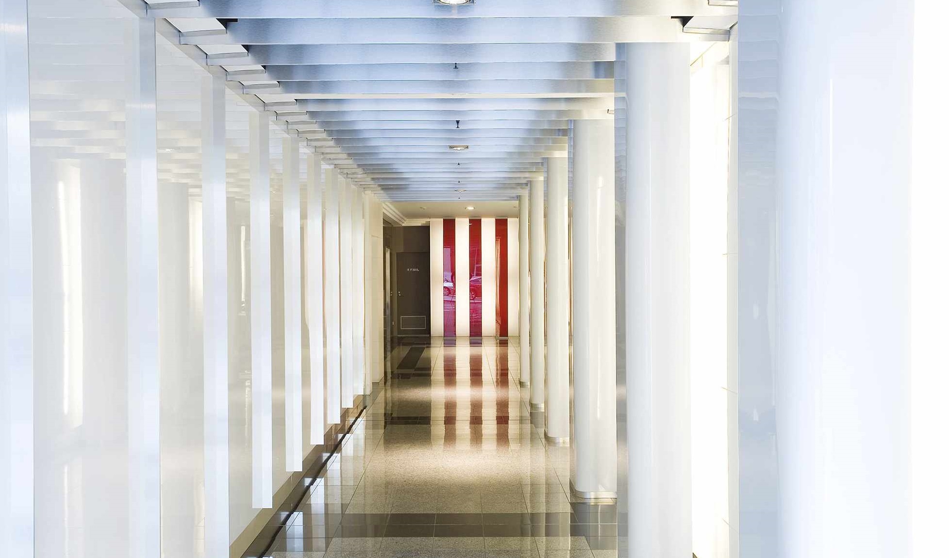
New lobby wall paneling was used in the form of high gloss white glass panels to one side + gloss white wall tiles to the other.
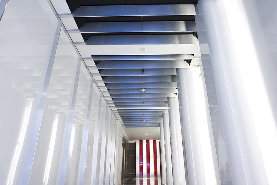
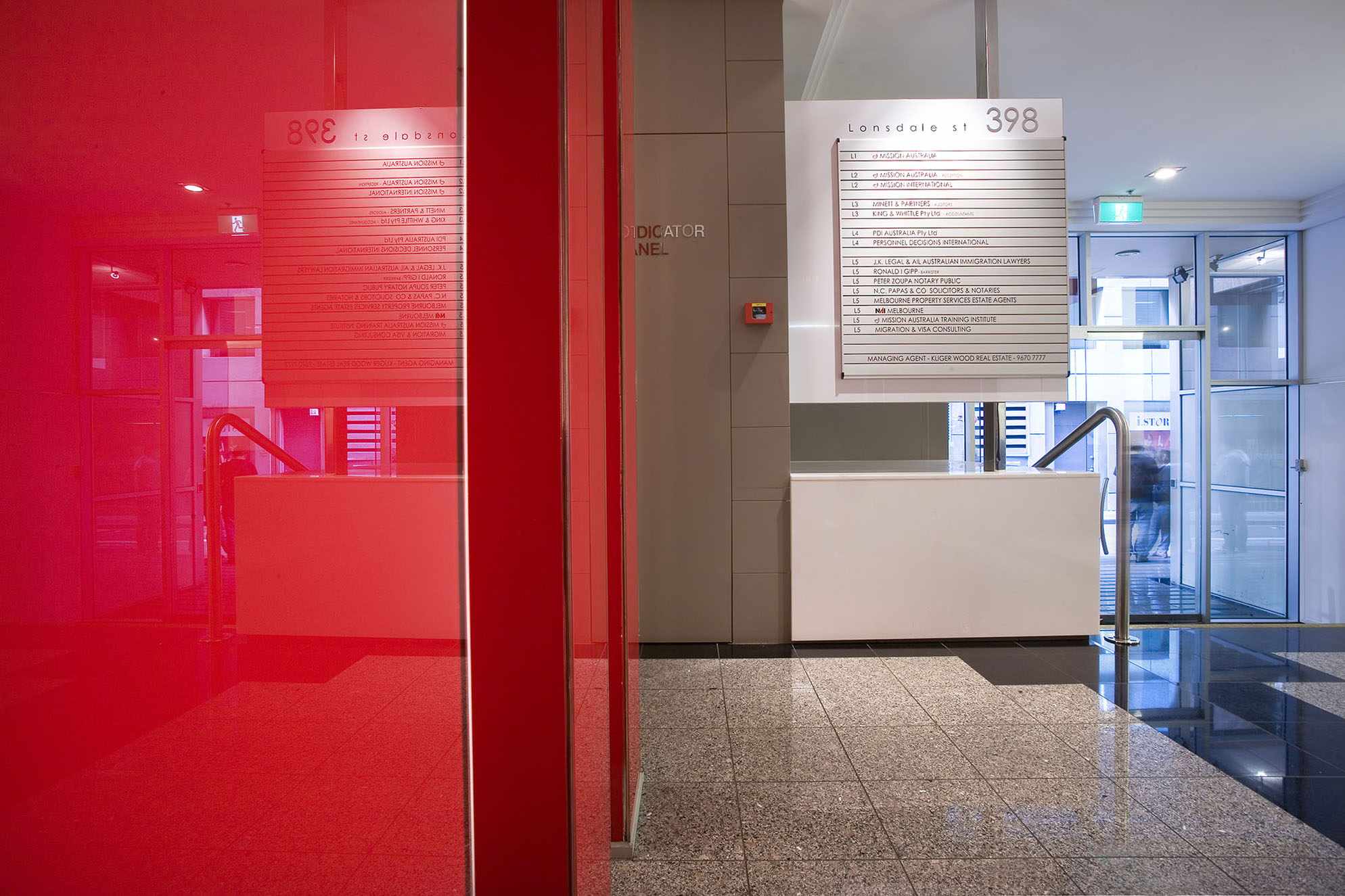
Protruding backlit gloss white columns accentuated the long passage leading to the lifts area + the rear wall culminated in a lit up feature. Feature lighting, new signage, a clean interior fitout + lit up image directory board were also provided.
The ceiling space was transformed by introducing thin floating blades throughout the passage which concealed the existing dated stepped ceiling cornice + provided concealed spaces to mount the building services within.
A visual focal point was designed for the visitor approaching from the long corridor. Previously the aspect that met the visitor on entering the building was an off white coloured wall in the very far distance that was far from part of the image that the landlord was looking to portray in order to attract appropriate tenants.
The building entrance space is now tasteful, modern + inviting for the visitor + tenant alike and the refurbishment should see the entrance appealing to visitors + tenants for many more years to come.
Here is another stylish example of another of our office building redesign upgrades.


